They say to never judge a book by its cover but that is exactly what we are doing when we look for an app that not only solves our problems but is also visually appealing at the same time. There is such a large selection of apps that customers need to know quickly which ones to get. What motivates someone to download an app from an app store?
According to a European Technographics Consumer Technology Online Survey done in 2012 by Forrester Research Inc., 63% of apps are discovered by searching in an app store, making it the most common method for finding and downloading apps. In 2016, there were 90 billion downloads from the Apple App Store and the Google Play Store combined. With this impressive data in mind, app store optimization is key to helping stand out from the competition and influencing downloads.
What is App Store Optimization?
App store optimization, also known as ASO, is the process of helping mobile apps rank higher in app store search results. With the app ranking higher in the results, it becomes more noticeable and discoverable to possible customers and traffic becomes more frequent on your app’s page, which means: more downloads.
There are several factors involved to help with app store optimization. Having a title, a stellar icon design, description, location, screenshots and video tutorials on your app detail page are all part of the process. It is also important to think of the keywords and language your target audience and potential customers will use to search for apps similar to yours.
Using Your App Icon Design to Increase Conversion Rates
With those factors in mind, the clean-cut design of your app icon also plays a major role in the app store optimization process because it is the first thing people notice when searching for apps. Having that visual appeal and unique design is important to stand out against competitors.
A strong first impression is essential to increase conversion rates because it can do so by up to 35%. In general, based on solid first impressions, 50% of people decide to install an app and 60% of visitors won’t scroll past them. (If you are wondering what a normal conversion rate is, an average rate would be 26.4%, the highest is 82% and the lowest is 0.36% from apps in the games category).
Creating the Best Possible App Icon
Branding for your App
Before even starting to think of the elements in your icon, you should give your app branding some serious thought. To help with this you can ask yourself a few questions about your brand: Who is going to use your app and why? What makes your app unique compared to the competition? What message do you want to get across to your app users? What is the tone of your app? What emotions do you want your users to feel when they use your app? In answering these questions you will have a clear picture of who you are as a brand.
Today we’ll only address the app icon specifically, but it is important to have in mind that it is not the only thing you should take into account. Everything from the colour scheme, to the name, typography, tone of voice and visual branding guidelines, help build the branding personality which creates a deeper and easier connection with customers.
Here are a couple of resources you can read and act on to make sure you have your branding game on point:
7 Important Mobile App Branding Strategies
Mobile App Branding: Tips, Strategies, and Examples
Best Techniques for Effective Mobile App Branding
Picking the Right Colours
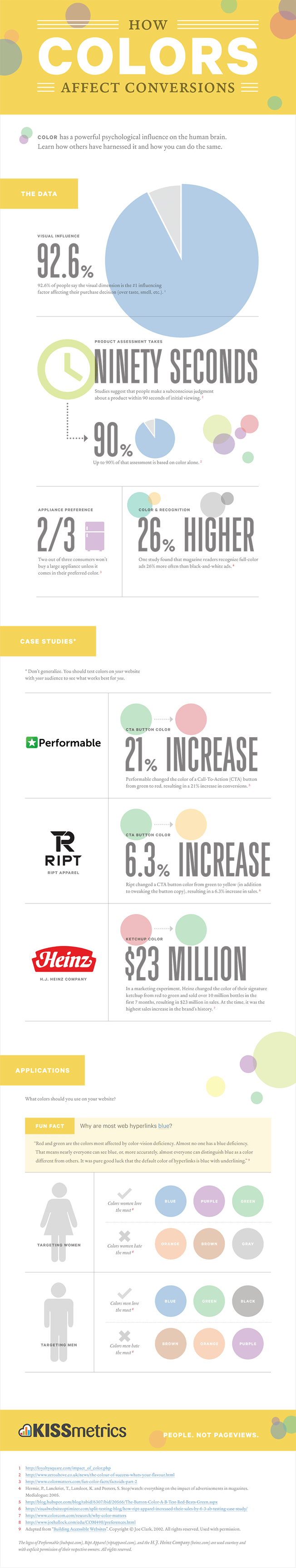
Picking the right colour for your app icon can help in determining its success because they are a reflection of the personality and theme of your brand. They have the strong power of persuasion with 90% of consumers judging products based solely on their colour.
In fact, the visual aspect of a product plays a large role in the purchase process with 92.6% of people saying it is the most important factor when buying something. For instance, as an experiment when Heinz changed their ketchup from red to green in the year 2000, 10 million bottles were sold in the first 7 months, bringing in $23 million in sales. At that time, this was the biggest sales increase they had ever experienced.
Colours show the feeling and mood your brand represents, it tells consumers subconsciously how they are supposed to feel when they see your app. Emotions and traits are often associated with colours, for instance, blue is often paired with trust and security, purple signifies sophistication, brown represents the outdoors and red means passion. They should be an accurate representation of the important values your brand embodies that you want to instill in your visitors and users.
Now that you are aware of the impact colours have on your brand’s success, here are some best practices to keep in mind when picking the right ones for you:
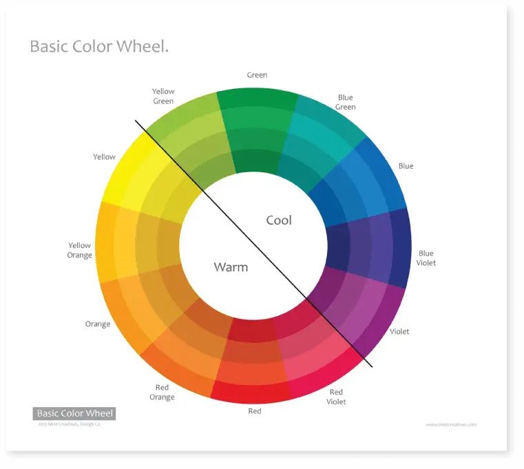
- Know your options. Check out what’s out there before picking a colour. The diagram below shows the colours that are most often used when designing app icons.
- Be consistent. Make sure to use a consistent colour scheme. You want your icon to match what is on the inside of your app when users open it. It does not make sense for your icon to have a nice colour scheme but inside the app itself looks very dull.
- Contrast. Having high and low contrasts can also be helpful to have colours stand out from each other at different degrees. You want to have your text or object contrast with their backgrounds. Naturally, yellow is a bright colour and blue is softer and darker, making it a higher contrast. Lower contrasts using different tones within the same colour can be difficult to read and so usually high contrast is preferred. However, some high contrasts can hurt your eyes, for instance, bright green against black. It is good to find a balanced colour scheme with just the right amount of contrast to make your icon pleasant.
- Complementary colours. There is a saying that opposites always attract, and so using complementary colours can be a good option for designing your icon to make it pop. These are colours that are complete opposites on the colour wheel, for example, red and green, blue and orange, and yellow and purple.
- Be considerate. Colour blindness is an important point that requires some consideration. Using a high contrast addresses this problem making things easier to read and enjoyable to see. It is no wonder that blue is a popular choice for icons because it tends to be the colour that even colour blindness can overcome.
If you are still unsure about which colour is best fit for your brand, you can try out this fun little company colour quiz to get you started. This website bases the results of your quiz on marketing articles and research studies. A few of the questions include how you would describe your customers, who your product or service is for and which characteristics best describe your company.
![]()

Designing the Elements of your App Icon
The Material Design website provides help with the design principles of your app, including guiding you through a grid and keyline shapes, specs and icon treatments. We have taken the following points directly from their website to help you out.
Grid and Keyline Shapes:
- Icon Sizes: “When creating an icon, view and edit it at 400% (192 x 192 dp), which will display edges at 4dp. By maintaining this ratio, any changes to the original will be scaled up or down proportionally, which preserves sharp edges and correct alignment when the scale is returned to 100% (48dp). The icon grid establishes clear rules for the consistent, but flexible, positioning of graphic elements.”
- Keyline Shapes: “Keyline shapes are based on the grid. By using core shapes as a baseline, you can maintain consistent visual proportions throughout your product icons. Square=Height: 152dp, Width: 152dp; Circle=Diameter: 176dp; Vertical rectangle=Height: 176dp, Width: 128dp; Horizontal rectangle=Height: 128dp, Width: 176dp.”
- Geometry: “These keyline shapes use preset standards: circle, square, rectangle, orthogonal, and diagonals. They unify product icons and maintain consistent placement on the grid.”
Specs:
- Anatomy: “To express a shared visual language, the graphic elements that make up a product icon should be consistent across all of a brand’s icons. Logos, in particular, should have characteristics that help establish familiarity across brand elements. A product icon’s underlying structure positions each element in front of the previous one, such that each logo is designed from the bottom up.”
- Lighting: “In the Material Design environment, virtual lights illuminate the scene and allow elements to cast shadows. Light is cast on the top of elements, creating a shadow that highlights the icon’s top and bottom edges. An angled light reinforces the sense of dimension across the elements.”
- Contact Shadow: “A contact shadow is a result of the virtual light from above. A soft shadow surrounds a Material element lightly on the top and left, and with slightly more emphasis below and to the right of the element. The shadow is contained within the icon’s background silhouette.”
- Edge Tint and Shade: “The top and bottom edges of Material elements provide a sense of depth, which is emphasized through edge tinting and shading: Tints highlight the top edge of an element (left, right, and bottom edges are not tinted); Shades darkens the bottom edge of an element (left, right, and top edges are not shaded).”
- Finish: “The finishing layer expresses the effect of Material Design’s virtual 45º light source. It extends from the top-left corner to the exterior edge of the icon’s silhouette.”
Be sure to check out this full guide on the Material Design website if you want to dive further into your design principles.
A/B Testing your App Icon
Once you have a couple of icon ideas in mind, the hardest part is making your final decision in picking only one. This decision ultimately decides the fate of your app brand and whether it will succeed in the app stores. This is where A/B testing comes into play.
A/B testing is a way to test two different versions of an app to see which works and performs best. In this case, you will be looking at which icon design is more popular and gets more clicks. This testing can make a big difference to your app’s success, for instance, the CashQuizz app was able to double its daily downloads by making adjustments and adding more colour variations to its old icon design, which increased the total number of downloads by over 150%. Gram Games is another app that was able to increase conversions by 26% through A/B testing their icon.
The testing process involves half of your traffic being shown an original version while the other half is shown a modified version of your app icon. The users’ experiences are then recorded, measured, collected and analyzed through a statistical engine. When experimenting, it is important to make sure both versions are extremely different and bold for clear testing answers.
For Android, Android developers can use Google Play’s A/B testing feature
which is an experimental option in their console that lets them test their icons. With iOS there is paid A/B testing on Facebook. If you are interested in knowing the exact steps on how to do these two A/B testing options check out this link.
Here are some other online tools to help with your app conversion rates with A/B testing:
Storemaven
SplitMetrics
Five Second Test
Best ASO Practices in Designing your App Icon
As we mentioned above in this post, the design of your app icon is one of the keys to success in the app store optimization process. Let’s take a look at a couple of best practices used to attract customers and increase downloads:
- Quality. A good quality icon should be simple, recognizable and unique enough to spot from a crowd of apps.
- Brand Identity. The design of your icon should make an emotional connection to your company’s values. It should reflect your brand identity.
- Clarity. It should convey a clear message about the app to customers and be eye-catching enough for them to want to click on it and download it.
- Get on the featured page. Customers check the app store featured page to see the best recent apps. Apps on this page tend to typically do really well in downloads because only the best performing apps are chosen to be featured by the app store. Having an app icon, app ratings, an app description and screenshots on your app detail page in the app store increases the chances of being downloaded and ending up on this page.
- Icon sizes. Make sure the icon design works in different shapes and sizes. Even if you have tested that your app icon looks good on phones and tablets, it is important to check that it works in the Apple App Store and the Google Play Store. After all, this is the first place most customers will see it. Here are some basic sizes your icon should have to fit different platforms and devices: 512pt x 512pt, 256pt x 256pt, 128pt x 128pt, 32pt x 32pt, 16pt x 16pt.
- No text necessary. Remember that icons are small, and so putting text in the icon design can be very difficult to read. It is also unnecessary since text is already written under the app icon.
- Avoid letters. Avoid using the first letter of your app brand as your icon, especially if it shares the same first letter as some of the most popular apps like Facebook, Pinterest or Skype. Your app will become overshadowed. However, if you decide to go this route, be sure to give it some distinguishing features against its competition. You do not want to be confused for a different app with a similar letter style icon design.
- Be original. Try not to stick too close to trends and your competitors. It is always good to be original in your design.
- Make it noticeable. Make sure the icon is recognizable and represents your brand’s purpose. It is okay to take the time to craft the design and shape of your icon to get it just right.
- Simplicity. The icon is the first thing potential customers see when looking at your app so make sure your app icon isn’t too busy visually. There can be some small details but keep them at a minimum. You do not want to confuse potential customers and make the icon hard to look at, especially when they are such a small size.
- Focal point. Make sure there is only one focal point centered in the app icon. This draws visitors’ eyes toward one spot.
- Be cautious with colour. Do not use a lot of colour just to make the icon more flashy. Smoother tones are good to use too.
- Be careful with fake text. If you are planning on using fake text in your icon, make sure you do not draw too much attention to the words and to shrink them to the point where they are illegible, making it obvious that the text is not meant to be read.
- No screenshots or photos. Avoid using screenshots and photos in the icons because details in photographs can be difficult to see in the small icon space and they do not accurately show your brand’s purpose.
Here are some pointers that are specific to Apple:
- Do not copy Apple. All Apple products are copyrighted and so you cannot use their icon elements in your own app icon.
- Give your icon a unique outline and shape. Apps on macOS can have icons that take on the shape of the objects they describe, for example, the contacts icon is in the shape of an address book. The unique outline grabs your attention which is a priority.
- Change macOS icon. Redesign your iOS app icon if you are also designing one for macOS. They should not be an exact copy of each other.
Here is a pointer specific to Google:
- Size and resolution. Make sure that your app will be displayed properly on all devices. It is good to keep in mind when building your app that Android runs on different devices which means the screen size and resolution changes. In this case, you would create a different icon for each type of screen density.
Final Thoughts on App Store Optimization
As you can see, even the simple act of picking a colour scheme for your icon can impact the outcome of your app’s success. Optimizing the design of the icon is the first step to getting your search rankings to climb in the Apple App Store and the Google Play Store.
Be creative, remember your brand values, don’t be shy to experiment and keep in mind those best practices for app store optimization and icon design. You’ll be on the feature page in no time!
Related Post:
Guide to Mobile App Development Process